Asian Art Museum Website
For the first project in my “Collaborative Project: Special Topics In Advanced Web Design” class I am taking the static website designs from my Asian Art museum rebrand project I did in the fall of 2011. During my portfolio 1 class in the spring 2013 semester, I reviewed all of the projects I had done since starting school in 2010. As part of the class I then had to re-work/update and improve each project. My Asian Art Museum rebrand project had specific pieces that needed to be re-worked since I knew so much more about good design and could improve a few of my redesigns. The website component of the project needed some serious work.
This was my final version of the website design at the end of the project when finished the first time in 2011.

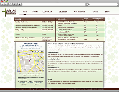
Notice how many times I used a drop shadow around each box and how heavy it was. Also, take note on how much empty space there was between the top slider and the row of boxes at the bottom on the homepage. On the “visit” page, the design is very boxy. Everything had a heavy drop shadow. The navigation was even not really aligned to anything other than its self.
This is what my re-worked website design looked like at the end of my portfolio 1 class in 2013.
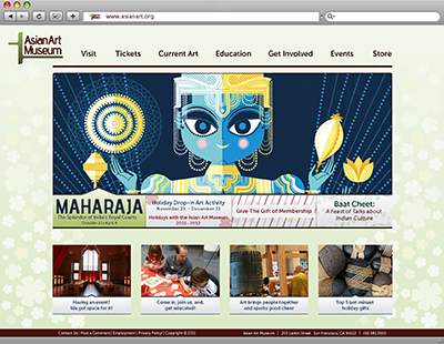
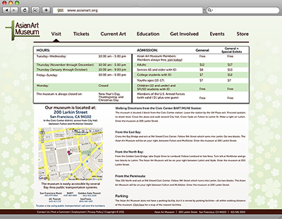
As you can see I made so many improvements to the overall design of the website. The homepage is laid out much better and I don’t have any wasted space between the slider and the row of boxes at the bottom on the page. The navigation is also better aligned to the page and the content. The logo is a bit oddly placed in the top left corner.
As you can tell, there is still room where I can make more design improvements. In this web class, along with my portfolio 2 class, I will take my designs, improve them further, and then code the site into a live version.