Hornblower Website Layout Update
access_timeOctober 12, 2014
folderDesign
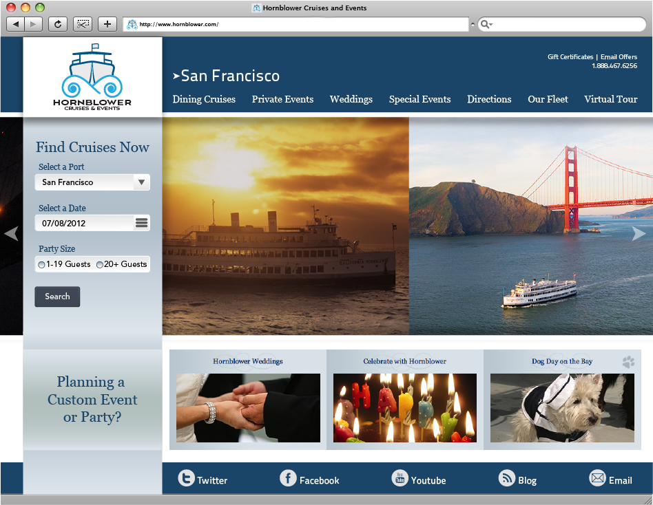
Take a look at my original website design for the Hornblower rebrand I created in the summer of 2012. At the time, I thought my design was pretty great when I finished it.
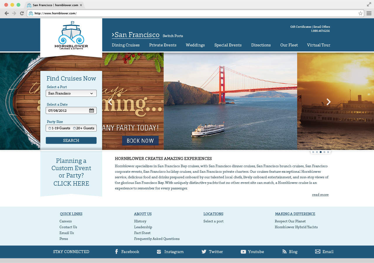
Now in my final portfolio class, I have rethought many of the choices I made for this part of the project. In the results below, my final version of the website layout, the look is polished, more refined, and cleaner. I used just one typeface choice throughout the site giving it a much more unified look. While the general structure of the website stays the same, a few simple design changes gives the site a refreshed look.