the challenge:
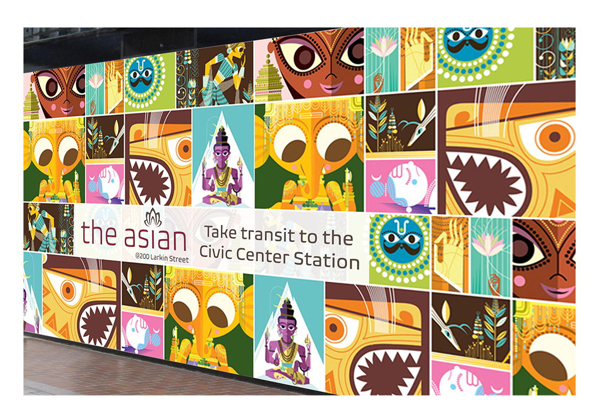
To create a refreshed design for the The Asian Art Museum of San Francisco, I first shortened the name to "the asian”, a name commonly known for the museum. I created a simple, cleaner logo, new business cards, updated website, exhibit advertising, and more. One of the main components includes a series of advertising based on the current exhibit at the time.
the result:
The refreshed design creates a pleasing aesthetic that is consistent and inline with the "vibe" at the asian. The project is unified, pulling together the theme of the museum as one core concept. Bold colors and angled shapes through out the project complement the structural design of the museum bringing it to the next level.


