Behind the Scenes: The Audio Edit
After finding the perfect audio track for the update to my 50 Logo 50 Days video (which you can watch here), it was time to make some edits. The original length of the audio was 1 minute and 20 seconds long. Not only did I need to shorten the total length, I needed to trim down the intro section to about 7 seconds long. Then I needed to cut a section out of the middle because the original ending has a great finish.
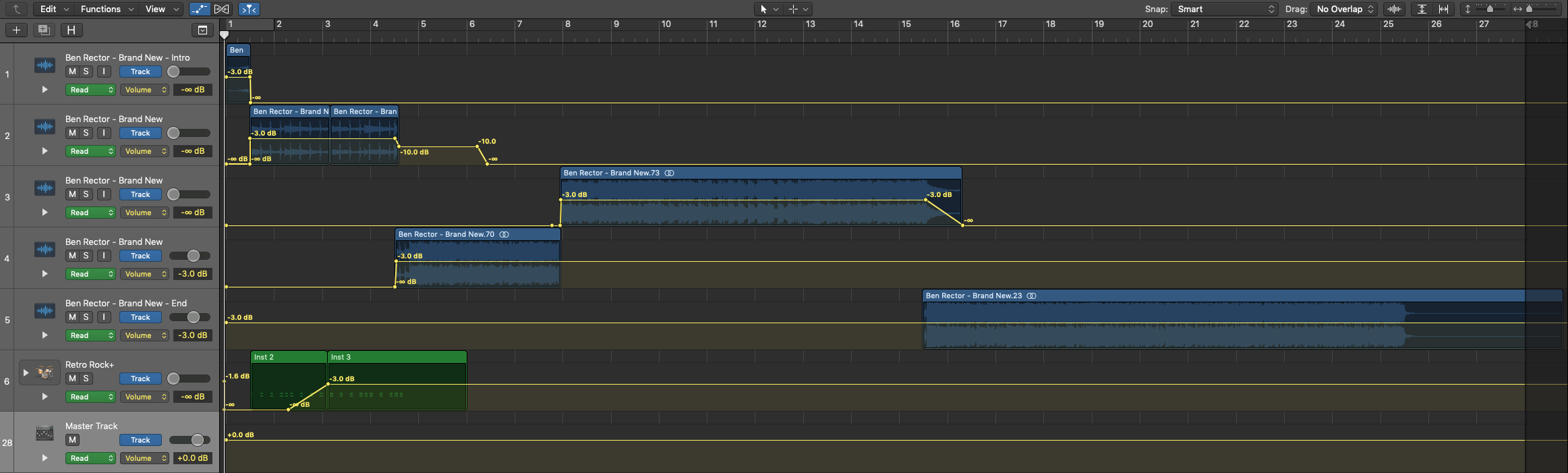
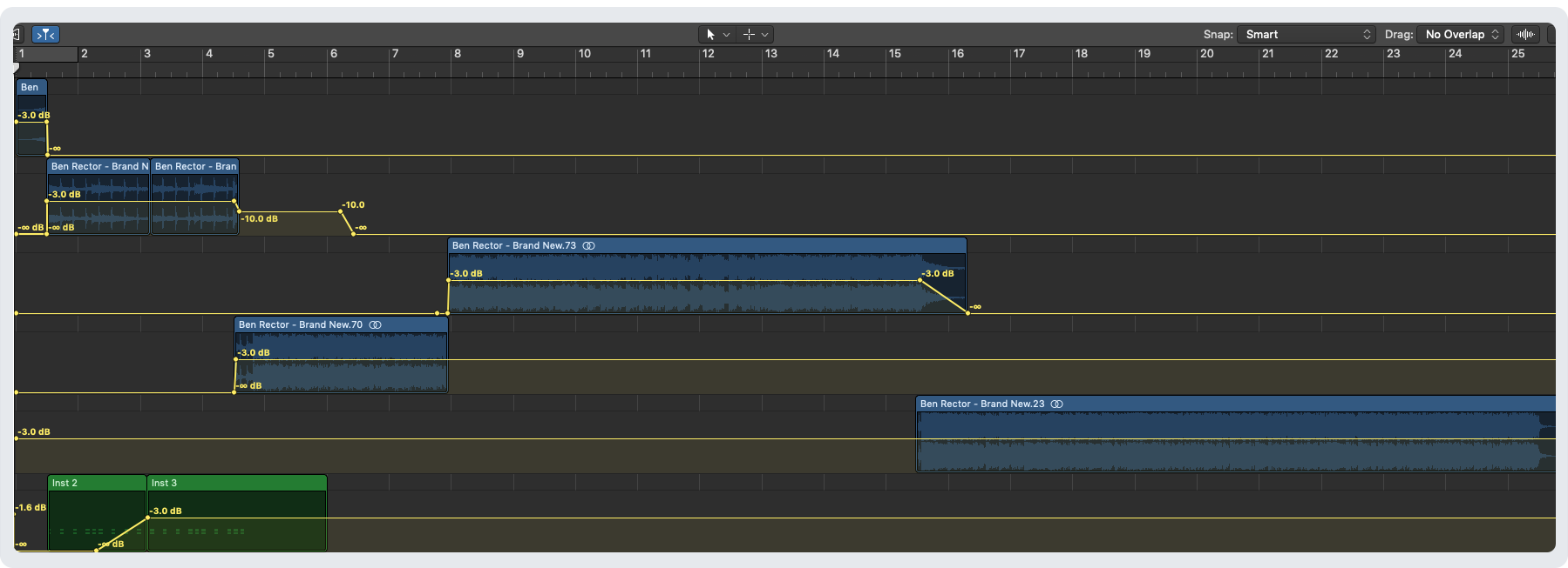
The blue colored audio tracks above represent the original audio. The green colored track is some additional drums and claps I added into the intro section to create a fuller sound. All of the yellow lines going horizontally across represent automation or simply fading in or out of the volume for that track.
With a few cuts here and a few cuts there, I managed to make it sound like a seamless audio track again. You really can’t even hear where I made the cuts. I’m pretty impressed with myself and think you should have a listen below.
Listen to the 50 Logos 50 Days 50 Minutes audio and follow along below:


50 Logo 50 Days 50 Minutes: Originals vs Updates
In the recent update to my 50 Logo 50 Days video where I replaced the music, I also took the time to update just a few of the logos that really needed it. The result are what you get from just a few more years of experience honing your craft. You can check out the video here.

San Francisco’s Iconic Landmarks – A Personal Project
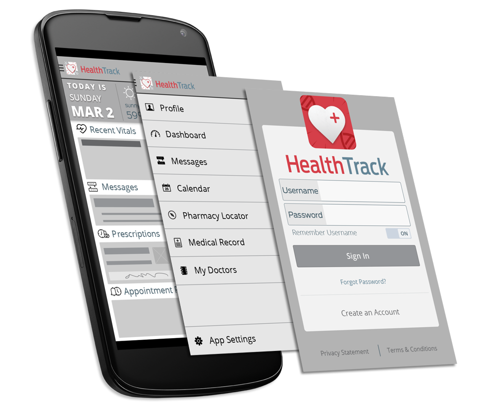
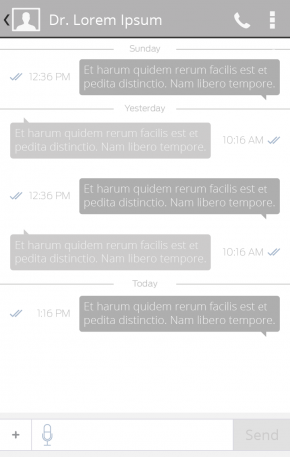
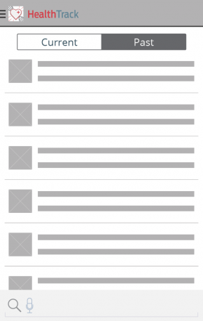
This is a personal project I have been working on for a while. It all started with a set of 49 icons that I recreated in illustrator of iconic San Francisco landmarks. From there the 49 icons spiraled into an app idea.
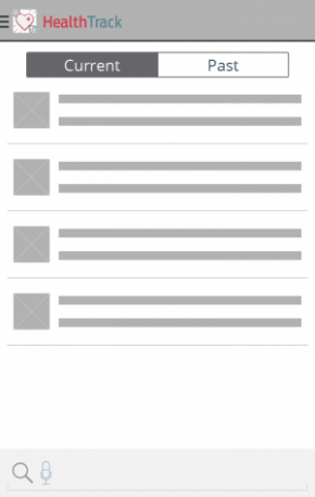
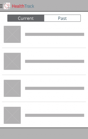
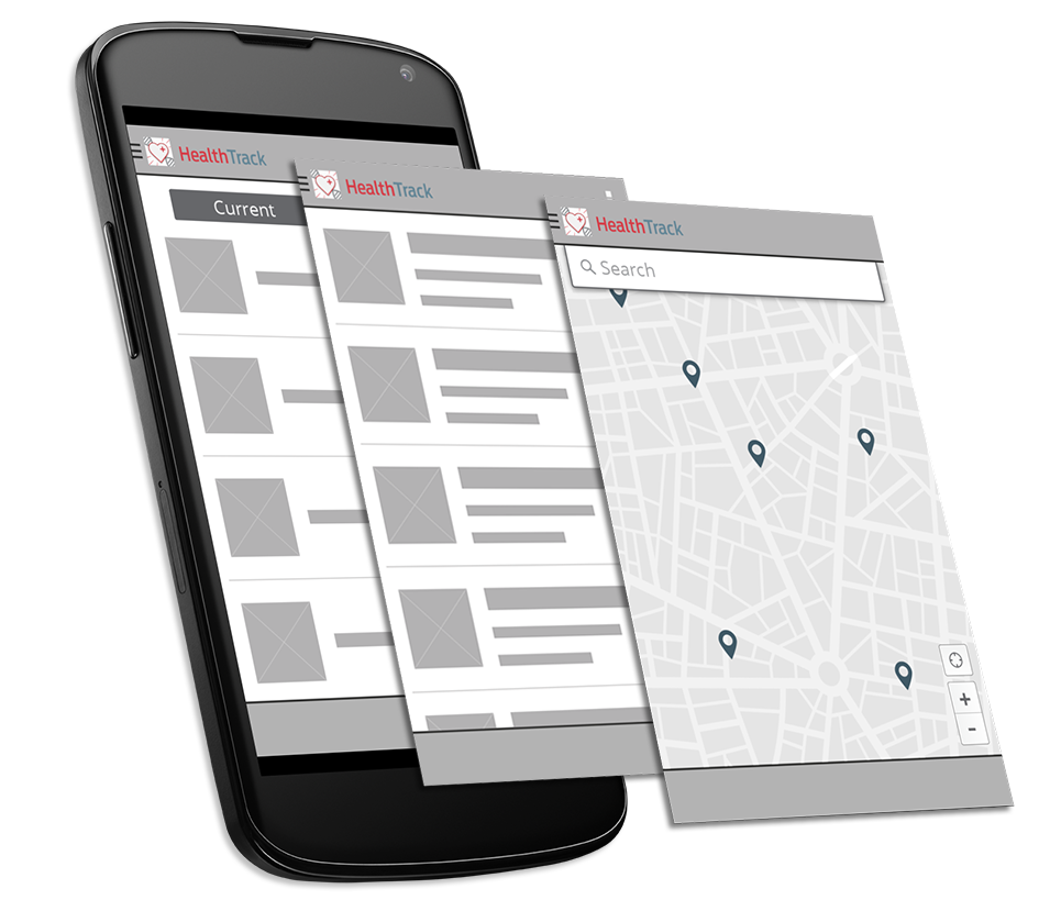
Click or tap on the interactive prototype to see inside the app. If you click or tap on parts that are not interactive, blue boxes will appear showing you where you can.
View the interactive prototype in a larger window here

Game of Tastes: A Game of Thrones Inspired Dinner
These are the intro and outro titles I created for one of the cafés at work. That café did a Game of Thrones theme for their end of semester dinner. These played throughout a longer video of top clips from each season of the show so far. The audio is for the purpose of this video only. On the day of the dinner, there was music selections from the show playing instead.
“The Fog of San Francisco” Website
This blog post comes a little later than it probably should but, I didn’t think about doing one back in december.
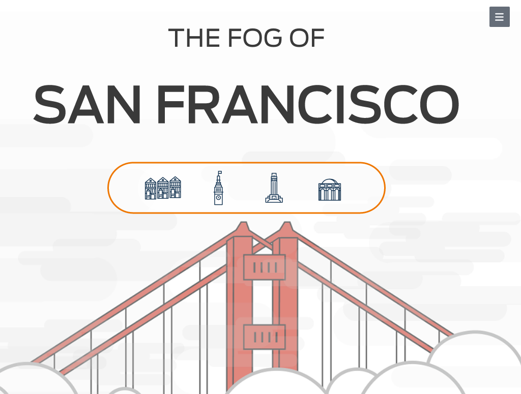
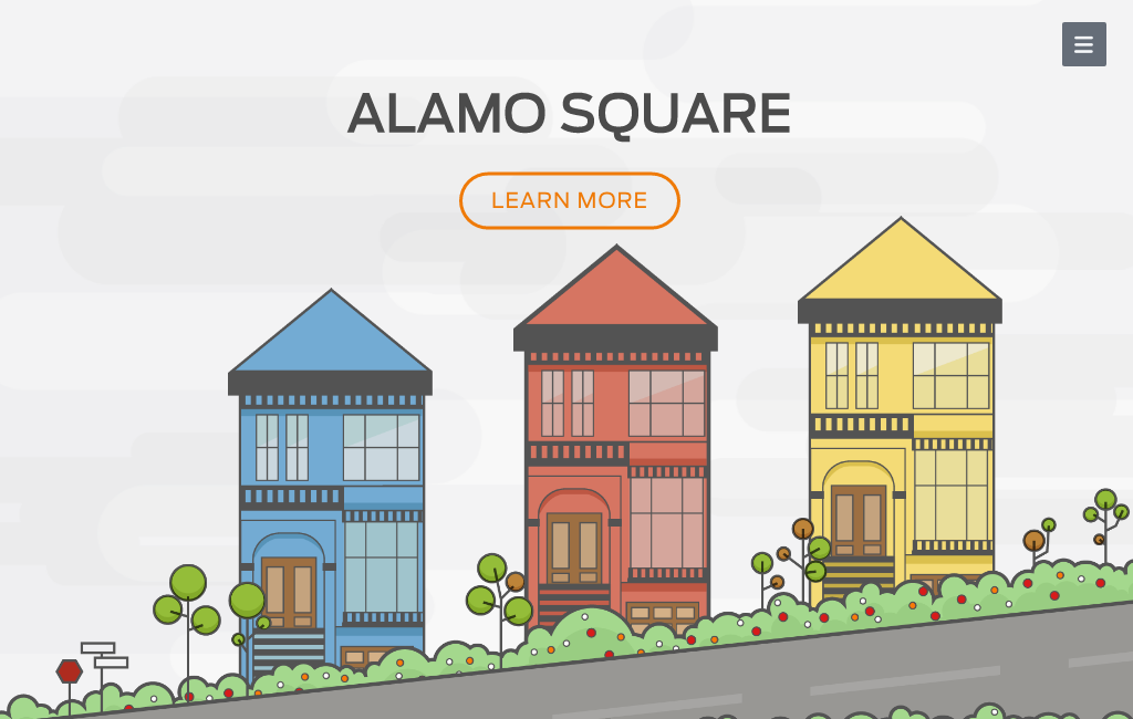
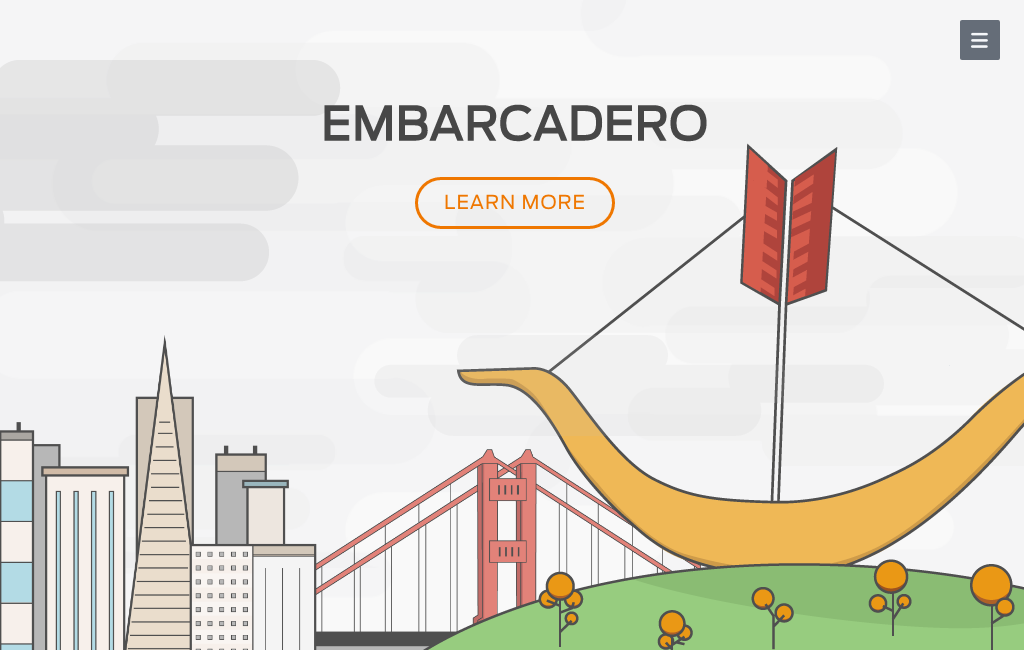
The Fog of San Francisco is a parallax website* that features four iconic neighborhoods in San Francisco. As you scroll through these four iconic neighborhoods of San Francisco you’ll be covered by fog. Along your fog filled journey you have the chance to visit each neighborhood. You’ll find a few interesting facts, how to get there, what you should do once you get there, and more.
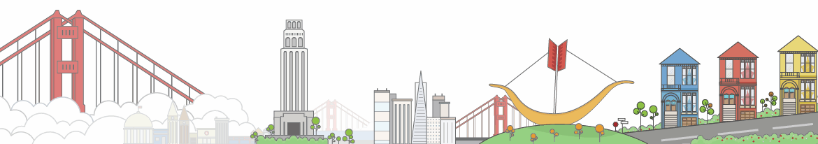
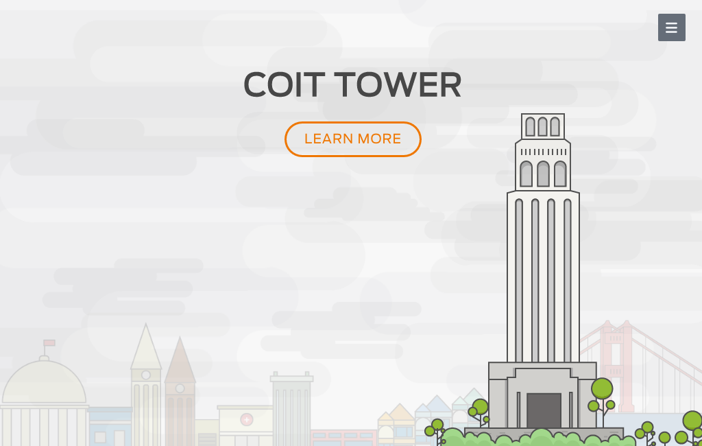
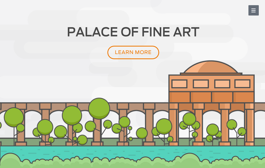
These are the neighborhoods you scroll through along your journey (starting at Alamo Square and ending at Palace of Fine Arts):
Behind all great projects, of course is an awesome team. For this project, I worked with Sundai Sun, Adam Wojewidka, and Ulrica Soenargo.
Sundai was crowned leader when it came to managing our github account and figuring out how our website would scroll. Adam was in charge of doing the modal window with a map and tying the up the lose ends. I chose the typeface used throughout the project as well as created an SF icons typeface. Though you can only see four neighborhood icons, I created 45 others(a total of 49). I made other small icons that are implemented in the navigation menu as an open/close toggle and directional arrows that guide you back from each neighborhood or tell you how to close the modal window with the map. Ulrica was in charge of doing all the beautifully detailed yet minimal style illustrations.
This is the navigation menu I created along with the icons for each of the four neighborhoods.
![]()
It was great working with my team and we made it. Thank you, team! Thank you to our teacher, Hamilton Cline and thank you Web & New Media Department at Academy of Art.
*Note: Chrome is a great browser but, “The Fog of San Francisco” may or may not play nice in older versions. If you’re experience of the fog seems a little more hazy than it was designed to be, please open “The Fog of San Francisco” in either Firefox or Safari. “Does it work in Internet Explorer” is a question that should not be asked. It will not work. Thank you!

Hornblower Website Layout Update
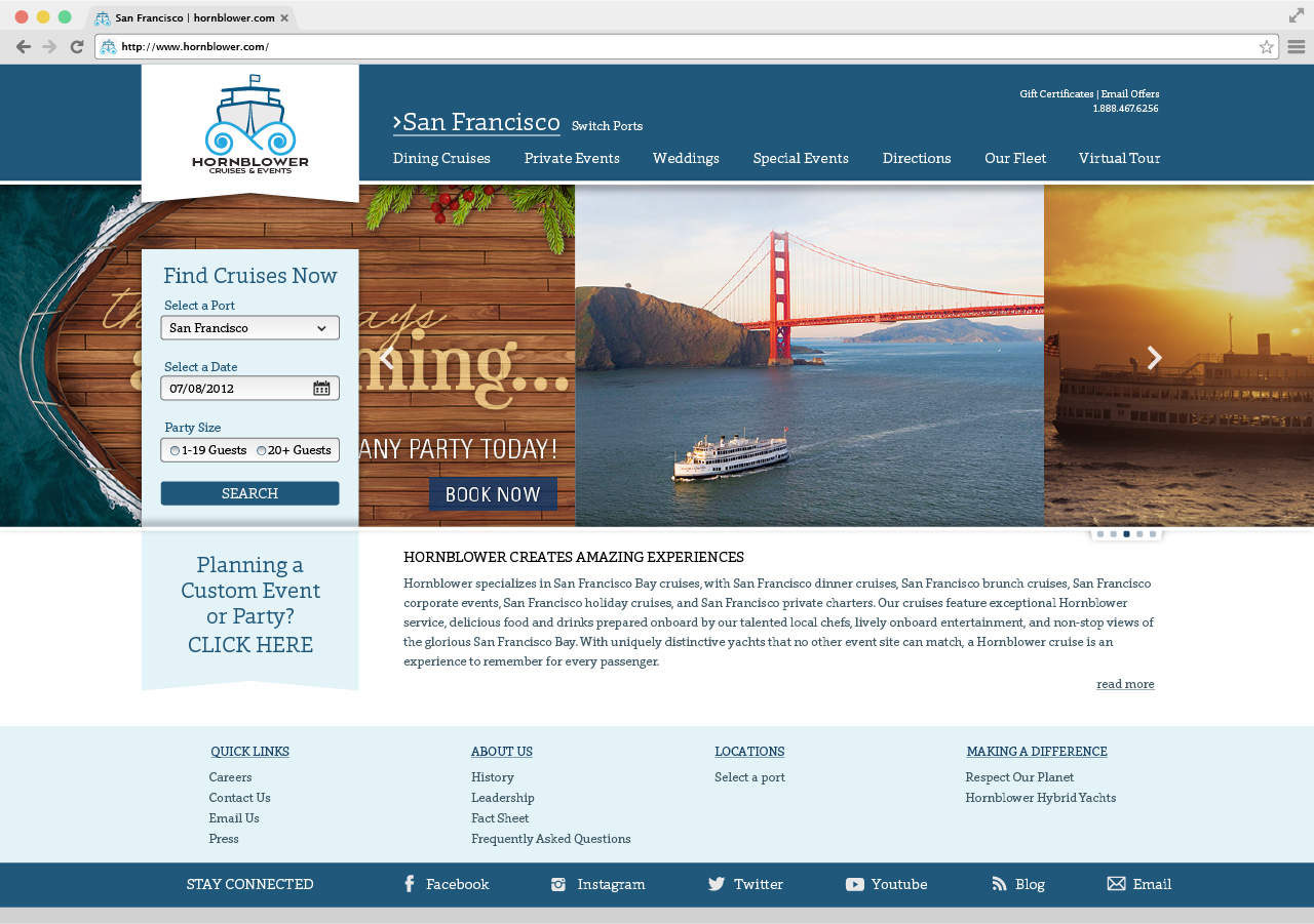
Take a look at my original website design for the Hornblower rebrand I created in the summer of 2012. At the time, I thought my design was pretty great when I finished it.
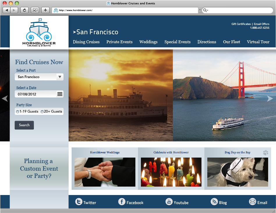
Now in my final portfolio class, I have rethought many of the choices I made for this part of the project. In the results below, my final version of the website layout, the look is polished, more refined, and cleaner. I used just one typeface choice throughout the site giving it a much more unified look. While the general structure of the website stays the same, a few simple design changes gives the site a refreshed look.
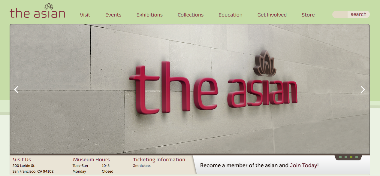
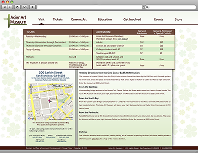
Updates on Asian Art museum website
I’ve been hard at work giving my design for the Asian Art museum website a much needed make over. For starters, my original logo design has been retired from the project. I created a completely new, clean, and stylish logo for the project. The website design has expanded from 960px wide to 1024px wide. The design layout for the top information slider has gone from displaying one large image with four different slide titles below to showing a large image but, only one title and subtitle. The use of small square dots on the lower right side as well as arrows on both sides of the slider indicate more content. The new elements are much more refined and will fit better within the overall design.
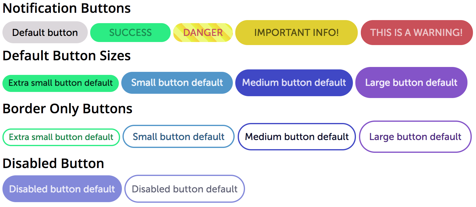
Buttons, Buttons, Buttons
This is my first dive into using scss and sass (Syntactically Awesome Style Sheets). My task was to make some buttons. This what my buttons look like and how they turned out. Notice the disabled button is the same size of the medium button but is opaque telling you its not clickable therefore disabled.
This is an interesting and fun way to create a variety of buttons.
Here is what the hover states of the buttons would look like. Some of the hover states are lighter and some are darker.
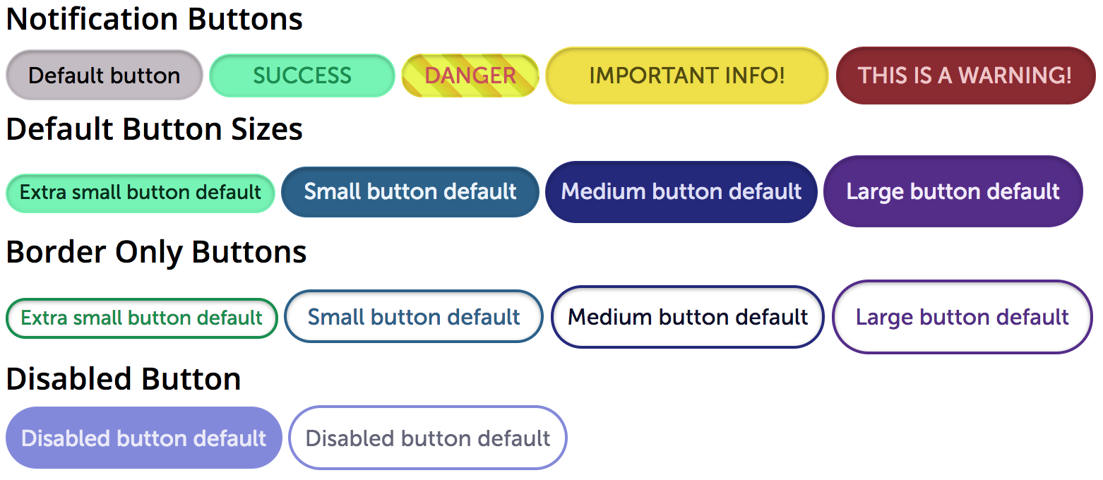
Now, why would I want to create all these buttons? Having these button styles not only saves me time when creating webpages where buttons are needed but, it also allows me to change one button style and anywhere I use that same button style it will update. To have a button is simple, One line of HTML code, the correct class name for the style I want, and everything else is magic.
Play around with the test buttons below and see for yourself how they work.
Notification Buttons
Default Button Sizes
Border Only Buttons
Disabled Button
Asian Art Museum Website
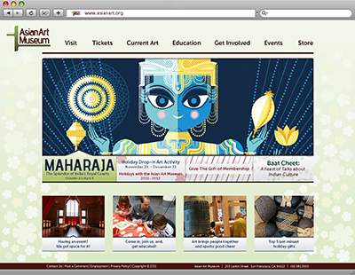
For the first project in my “Collaborative Project: Special Topics In Advanced Web Design” class I am taking the static website designs from my Asian Art museum rebrand project I did in the fall of 2011. During my portfolio 1 class in the spring 2013 semester, I reviewed all of the projects I had done since starting school in 2010. As part of the class I then had to re-work/update and improve each project. My Asian Art Museum rebrand project had specific pieces that needed to be re-worked since I knew so much more about good design and could improve a few of my redesigns. The website component of the project needed some serious work.
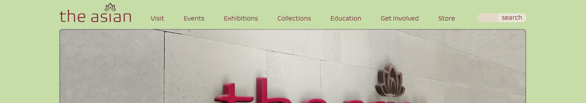
This was my final version of the website design at the end of the project when finished the first time in 2011.

Notice how many times I used a drop shadow around each box and how heavy it was. Also, take note on how much empty space there was between the top slider and the row of boxes at the bottom on the homepage. On the “visit” page, the design is very boxy. Everything had a heavy drop shadow. The navigation was even not really aligned to anything other than its self.
This is what my re-worked website design looked like at the end of my portfolio 1 class in 2013.
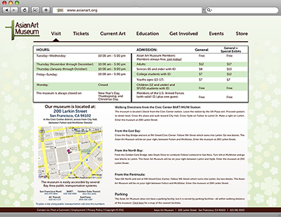
As you can see I made so many improvements to the overall design of the website. The homepage is laid out much better and I don’t have any wasted space between the slider and the row of boxes at the bottom on the page. The navigation is also better aligned to the page and the content. The logo is a bit oddly placed in the top left corner.
As you can tell, there is still room where I can make more design improvements. In this web class, along with my portfolio 2 class, I will take my designs, improve them further, and then code the site into a live version.